library(knitr)
opts_chunk$set(warning = FALSE, message = FALSE, fig.path = 'figs/', dev.args = list(bg = 'transparent'))
library(tidyverse)
library(GGally)
library(vegan)
library(ggdendro)
library(dendextend)
library(FactoMineR)
library(ggord)
library(mapview)
library(sf)
library(randomForest)
library(gridExtra)
library(here)
library(patchwork)
# get legend from an existing ggplot object
g_legend <- function(a.gplot){
tmp <- ggplot_gtable(ggplot_build(a.gplot))
leg <- which(sapply(tmp$grobs, function(x) x$name) == "guide-box")
legend <- tmp$grobs[[leg]]
return(legend)}
load(file = here('data', 'dat.RData'))
# rename toxicity columns
dat <- dat %>%
rename(
`Embr. surv.` = embr_surv,
`Amph. surv.` = amph_surv,
`% TN` = tn,
`% TOC` = toc,
`% Fines` = fine
)
# nutrients formatted data
# outlier removed, some variables transformed, values standardized
dat_frm <- dat %>%
select(station, depth, `% TOC`, `% TN`, `% Fines`, `Amph. surv.`, `Embr. surv.`) %>%
select(-depth) %>%
filter(`Amph. surv.` > 30) %>%
# filter(`% TN` < 0.4 & `% TOC` < 4 & `Amph. surv.` > 30)%>%
mutate(
`% TN` = log10(`% TN`),
`% TOC` = log10(`% TOC`),
`% Fines` = ifelse(is.na(`% Fines`), mean(`% Fines`, na.rm = TRUE), `% Fines`),
`Embr. surv.` = ifelse(is.na(`Embr. surv.`), mean(`Embr. surv.`, na.rm = TRUE), `Embr. surv.`)
) %>%
column_to_rownames('station') %>%
decostand(method = 'standardize')
# metals formatted data
# outliers removed, values standardized
dat_frm_mets <- dat %>%
select(-`% TOC`, -`% Fines`, -`% TN`, -depth, -lat, -lon) %>%
filter(`Amph. surv.` > 30) %>%
filter(Hg < 5) %>%
filter(Cr < 100) %>%
filter(Ba < 600) %>%
filter(Sb < 1.3) %>%
filter(Ag < 2) %>%
mutate(
`Embr. surv.` = ifelse(is.na(`Embr. surv.`), median(`Embr. surv.`, na.rm = TRUE), `Embr. surv.`),
Al = ifelse(is.na(Al), median(Al, na.rm = TRUE), Al),
Sb = ifelse(is.na(Sb), median(Sb, na.rm = TRUE), Sb),
As = ifelse(is.na(As), median(As, na.rm = TRUE), As)
) %>%
column_to_rownames('station') %>%
decostand(method = 'standardize')
# ggplot theme1
mythm1 <- theme_bw(base_family = 'serif') +
theme(
legend.position = 'none',
strip.background = element_blank(),
plot.margin = ggplot2::margin(0, 2, 0, 2, "pt")
)
# ggplot theme2
mythm2 <- theme_bw(base_family = 'serif') +
theme(
legend.position = 'none',
strip.background = element_blank()
) 1 Figures
1.1 Dendrogram nutrients
set.seed(1234)
# cluster with euclidean dissim, ward grouping
dend <- dat_frm %>%
vegdist(method = 'euclidean') %>%
hclust(method = 'ward.D2')
# grouping vector
ngrps <- 4
grps <- cutree(dend, k = ngrps)
# adonis(dat_frm ~ grps, method = 'eu', permutations = 1000)
# color vector for groups
cols <- mapviewGetOption("vector.palette")(ngrps)
cols[4] <- 'orange'
colsd <- cols[c(1, 3, 4, 2)]
p1 <- dend %>%
as.dendrogram %>%
set("labels_cex", NA) %>%
color_branches(k = ngrps, col = cols) #%>%
# color_labels(k = ngrps, col = colsd)
jpeg(here('figs', 'siteclsts.jpg'), height = 5.5, width = 7, units = 'in', res = 500, family = 'serif')
par(mar = c(2.5, 4.5, 0.25, 0))
plot(p1, ylab = 'Dissimilarity')
legend('topright', legend = c('1', '2', '3', '4'), fill = colsd, title = 'Groups', bty = 'n')
title(xlab = 'Monitoring stations (153)', line = 0)
dev.off()knitr::include_graphics(here('figs', 'siteclsts.jpg'))
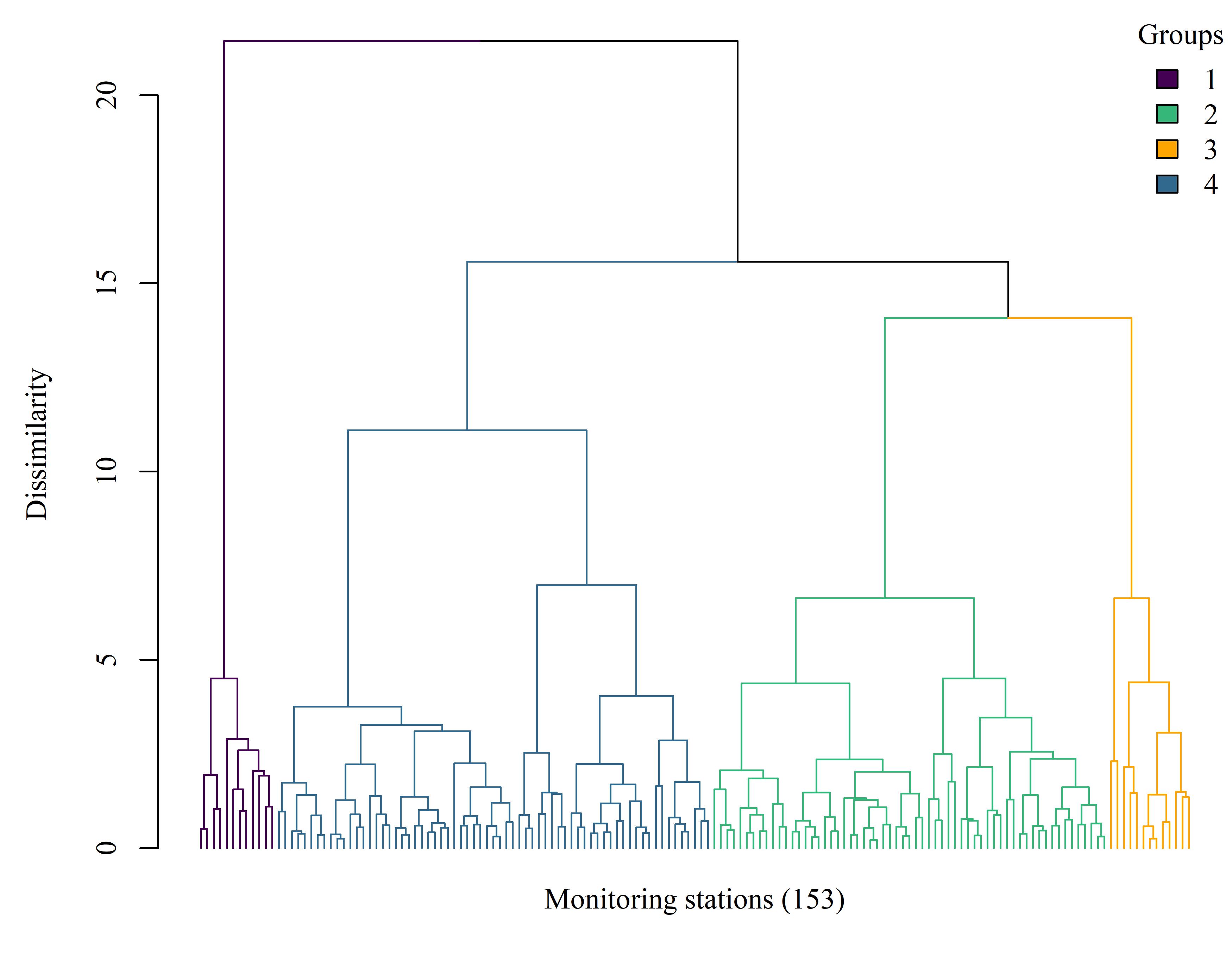
Figure 1.1: Dendrogram showing site clusters based on a dissimilarity matrix of Euclidean distances for the nutrient constituents and toxicity results. The tree was cut to identify site groupings within which relative values of the measured variables were similar. Sites closer to each other at the terminal branches are more similar. Sites distribution: group 1, 12 sites; group 2, 107; group 3, 20; group 4, 14.
1.2 Pairs plot, nutrients
cols <- cols[c(1, 3, 4, 2)]
toplo <- dat_frm %>%
mutate(Groups = as.character(grps))
p <- ggpairs(toplo, mapping = ggplot2::aes(fill = Groups, colour = Groups))
for (row in seq_len(p$nrow))
for (col in seq_len(p$ncol))
p[row, col] <- p[row, col] + scale_colour_manual(values = cols) + scale_fill_manual(values = cols)
# circlize_dendrogram(p1)
jpeg(here('figs', 'prplts.jpg'), height = 7, width = 7, units = 'in', res = 500, family = 'serif')
p
dev.off()knitr::include_graphics(here('figs', 'prplts.jpg'))
Figure 1.2: A generalized pairs plot (Emerson et al. 2013) displaying paired combinations of categorical and continuous variables. The site groupings are based on differences among sites using sediment nutrient data and results of toxicity tests.
1.3 PCA nutrients
ppp <- PCA(dat_frm, scale.unit = F, graph = F)
p1 <- ggord(ppp, grp_in = as.character(grps), vec_ext = 3, alpha = 0.8, size = 2, txt = 4, arrow = 0.2, cols = cols, repel = T, coord_fix = F) +
mythm2 +
ggtitle('(a)')
p2 <- ggord(ppp, grp_in = as.character(grps), axes = c('2', '3'), vec_ext = 3, alpha = 0.8, size = 2, txt = 4, arrow = 0.2, cols = cols, repel = T, coord_fix = F) +
mythm2 +
ggtitle('(b)')
p3 <- ggord(ppp, grp_in = as.character(grps), axes = c('1', '3'), vec_ext = 3, alpha = 0.8, size = 2, txt = 4, arrow = 0.2, cols = cols, repel = T, coord_fix = F) +
theme(legend.position = 'top') +
ggtitle('(c)')
pleg <- g_legend(p3)
p3 <- p3 + mythm2
jpeg(here('figs', 'pcanuts.jpg'), height = 4.7, width = 11, units = 'in', res = 500, family = 'serif')
# {p1 + p2 + p3 + plot_layout(ncol = 1)} -
# pleg + plot_layout(ncol = 2, widths = c(1, 0.2))
wrap_elements(pleg) + {p1 + p2 + p3 + plot_layout(ncol = 3)} +
plot_layout(ncol = 1, heights = c(0.2, 1))
dev.off()knitr::include_graphics(here('figs', 'pcanuts.jpg'))
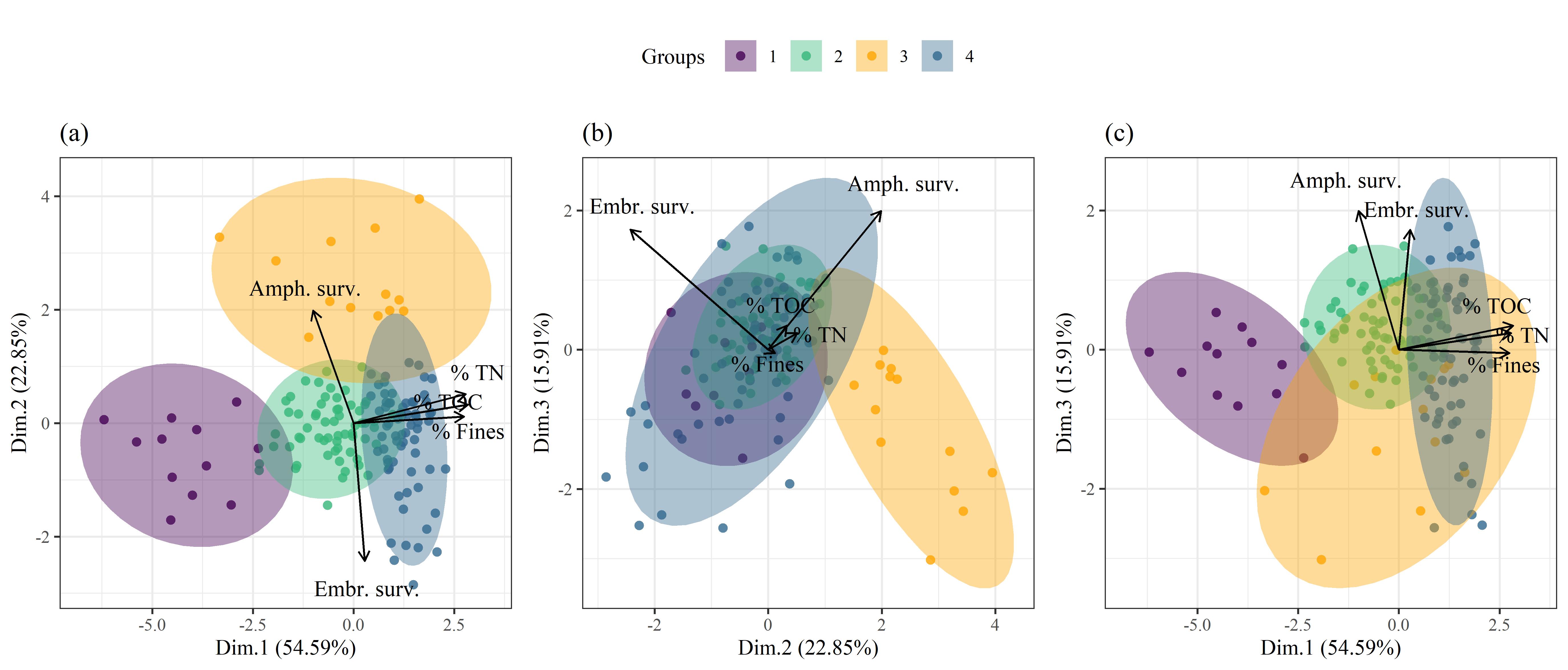
Figure 1.3: Site groupings from clustering analysis and variance among the measured variables using principal components analysis. Vectors include % total nitrogen, % total organic content, % fines, amphipod survivability, and embryonic survivability. The first three PCA axes are shown, with each plot showing a different combination of axes: (a) axes 1 and 2, (b) axes 2 and 3, (c) axes 1 and 3.
1.4 Dendrogram metals
# metals clustering
set.seed(1234)
ngrps <- 4
# metals cluster colors
cols <- mapviewGetOption("vector.palette")(ngrps)
cols[4] <- 'orange'
colsd <- cols[c(1, 3, 4, 2)]
# cluster with euclidean dissim, ward grouping
dend <- dat_frm_mets %>%
vegdist(method = 'euclidean') %>%
hclust(method = 'ward.D2')
# grouping vector
grps <- cutree(dend, k = ngrps)
# adonis(dat_frm_mets ~ grps, method = 'eu', permutations = 1000)
p1 <- dend %>%
as.dendrogram %>%
set("labels_cex", NA) %>%
color_branches(k = ngrps, col = cols[c(1, 3, 2, 4)]) #%>%
# color_labels(k = ngrps, col = colsd)
jpeg(here('figs', 'siteclstsmet.jpg'), height = 5.5, width = 7, units = 'in', res = 500, family = 'serif')
par(mar = c(2.5, 4.5, 0.25, 0))
plot(p1, ylab = 'Dissimilarity')
legend('topright', legend = c('1', '2', '3', '4'), fill = colsd, title = 'Groups', bty = 'n')
title(xlab = 'Monitoring stations (153)', line = 0)
dev.off()knitr::include_graphics(here('figs', 'siteclstsmet.jpg'))
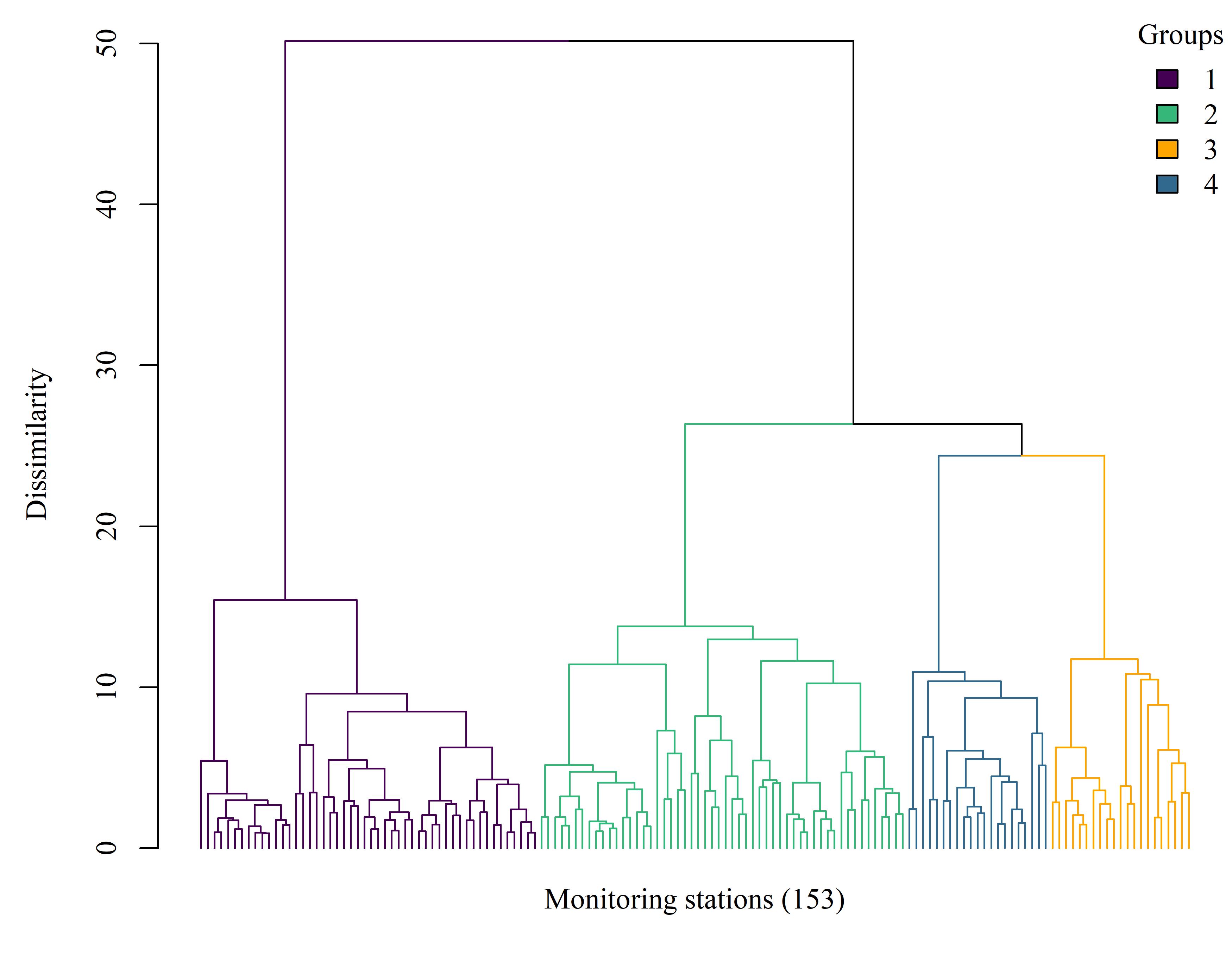
Figure 1.4: Dendrogram showing site clusters based on a dissimilarity matrix of Euclidean distances for the metal constituents and toxicity results. The tree was cut to identify site groupings within which relative values of the measured variables were similar. Sites closer to each other at the terminal branches are more similar. Sites distribution: group 1, 12 sites; group 2, 107; group 3, 20; group 4, 14.
1.5 Metals group summaries
cols <- cols[c(1, 3, 4, 2)]
colgrp <- data.frame(
grps = c(1:ngrps),
cols = cols,
stringsAsFactors = F
)
# data for summary plot
toplo <- dat_frm_mets %>%
mutate(grps = grps) %>%
left_join(colgrp, by = 'grps') %>%
mutate(grps = factor(grps)) %>%
gather('var', 'val', -grps, -cols) %>%
group_by(grps, cols, var) %>%
summarise(
med = quantile(val, probs = 0.5, na.rm = T),
min = quantile(val, probs = 0.05, na.rm = T),
max = quantile(val, probs = 0.95, na.rm = T)
) %>%
ungroup() %>%
mutate(var = fct_relevel(var, 'Amph. surv.', 'Embr. surv.'))
p <- ggplot(toplo, aes(x = grps, y = med)) +
geom_errorbar(aes(ymin = min, ymax = max), width = 0) +
geom_point(pch = 21, fill = toplo$cols, size = 3) +
facet_wrap(~var, ncol = 5) +
mythm1 +
scale_y_continuous('Standardized measurements') +
scale_x_discrete('Groups')
jpeg(here('figs', 'metsums.jpg'), height = 7, width = 4.5, units = 'in', res = 500, family = 'serif')
p
dev.off()knitr::include_graphics(here('figs', 'metsums.jpg'))
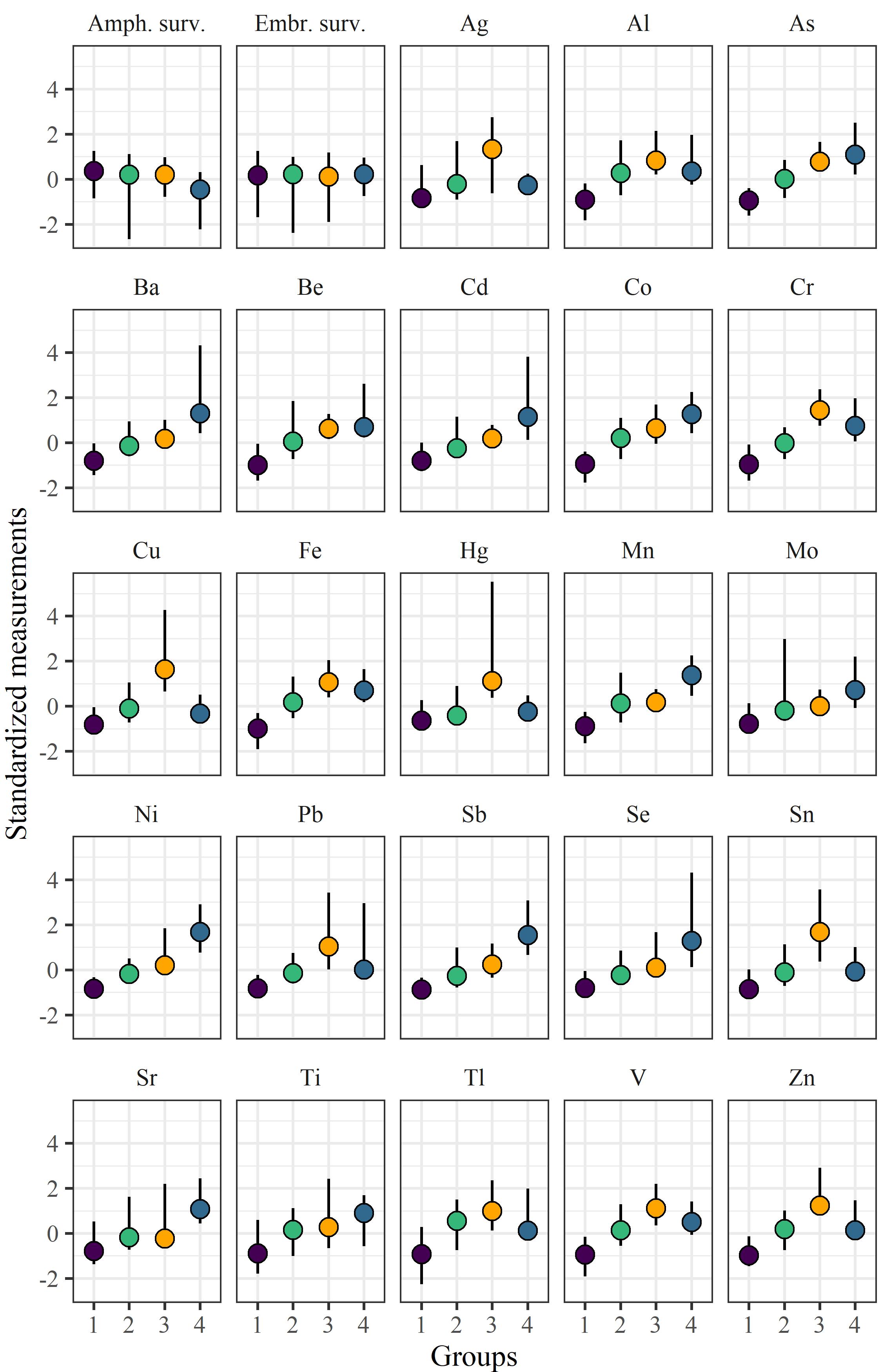
Figure 1.5: Summaries (median and 5th/95th percentiles) of toxicity measurements and metal concentrations among the groups defined with cluster analysis. The y-axis is standardized for relative comparisons among groups and constituents.
1.6 PCA metals
ppp <- PCA(dat_frm_mets, scale.unit = F, graph = F)
p1 <- ggord(ppp, grp_in = as.character(grps), vec_ext = 9, alpha = 0.8, size = 2, txt = 4, arrow = 0.2, cols = cols, coord_fix = F) +
mythm2 +
ggtitle('(a)')
p2 <- ggord(ppp, grp_in = as.character(grps), axes = c('2', '3'), vec_ext = 9, alpha = 0.8, size = 2, txt = 4, arrow = 0.2, cols = cols, coord_fix = F) +
mythm2 +
ggtitle('(b)')
p3 <- ggord(ppp, grp_in = as.character(grps), axes = c('1', '3'), vec_ext = 9, alpha = 0.8, size = 2, txt = 4, arrow = 0.2, cols = cols, coord_fix = F) +
theme(legend.position = 'top') +
ggtitle('(c)')
pleg <- g_legend(p3)
p3 <- p3 + mythm2
jpeg(here('figs', 'pcamets.jpg'), height = 4.7, width = 11, units = 'in', res = 500, family = 'serif')
# {p1 + p2 + p3 + plot_layout(ncol = 1)} -
# pleg + plot_layout(ncol = 2, widths = c(1, 0.2))
wrap_elements(pleg) + {p1 + p2 + p3 + plot_layout(ncol = 3)} +
plot_layout(ncol = 1, heights = c(0.2, 1))
dev.off()knitr::include_graphics(here('figs', 'pcamets.jpg'))
Figure 1.6: Site groupings from clustering analysis and variance among the measured variables using principal components analysis. Vectors include amphipod survivability, embryonic survivability, and 23 metal constituents. The first three PCA axes are shown, with each plot showing a different combination of axes: (a) axes 1 and 2, (b) axes 2 and 3, (c) axes 1 and 3.
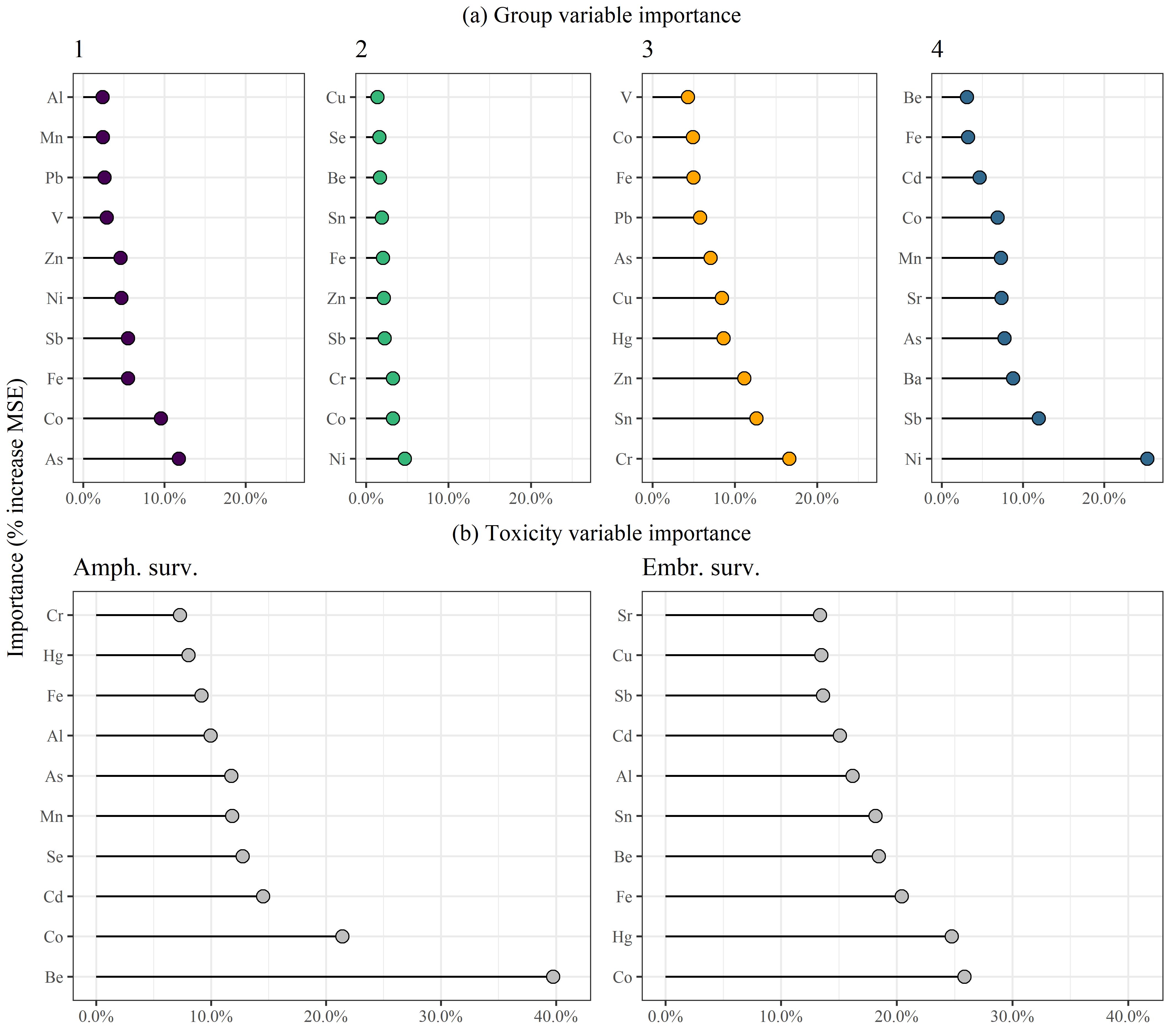
1.7 Metals variable importance
tomod <- dat_frm_mets %>%
mutate(grps = factor(grps)) %>%
rename(
amph_surv = `Amph. surv.`,
embr_surv = `Embr. surv.`
)
set.seed(123)
tmp <- randomForest(grps ~ .,
data = tomod,
importance = TRUE,
ntree = 1000, na.action = na.omit)
# plos for variable importance groupings
plos <- tmp$importance %>%
as.data.frame %>%
rownames_to_column('var') %>%
dplyr::select(-MeanDecreaseAccuracy, -MeanDecreaseGini) %>%
gather('grp', 'importance', -var) %>%
group_by(grp) %>%
nest %>%
mutate(
implo = pmap(list(as.character(grp), data), function(grp, data){
colfl <- colgrp %>%
filter(grps %in% grp) %>%
pull(cols)
toplo <- data %>%
arrange(-importance) %>%
.[1:10, ] %>%
mutate(var = factor(var, levels = var))
p <- ggplot(toplo, aes(x = var, y = importance)) +
geom_segment(aes(xend = var, yend = 0)) +
geom_point(fill = colfl, pch = 21, size = 3) +
theme_bw() +
theme(
axis.title.x = element_blank(),
# axis.text.x = element_text(angle = 45, hjust = 1, vjust = 1),
axis.title.y = element_blank()
) +
ggtitle(grp) +
scale_y_continuous(limits = c(0, 0.26), labels = scales::percent) +
coord_flip()
return(p)
})
)
# variable importance for toxicity
plos2 <- dat_frm_mets %>%
gather('var', 'val', `Amph. surv.`, `Embr. surv.`) %>%
group_by(var) %>%
nest %>%
mutate(
implo = pmap(list(var, data), function(var, data){
tmp <- randomForest(val ~ .,
data = data,
importance = TRUE,
ntree = 1000, na.action = na.omit)
toplo <- tmp$importance %>%
as.data.frame %>%
rownames_to_column('var') %>%
dplyr::select(-IncNodePurity) %>%
rename(importance = `%IncMSE`) %>%
arrange(-importance) %>%
.[1:10, ] %>%
mutate(var = factor(var, levels = var))
p <- ggplot(toplo, aes(x = var, y = importance)) +
geom_segment(aes(xend = var, yend = 0)) +
geom_point(fill = 'grey', pch = 21, size = 3) +
theme_bw() +
theme(
axis.title.x = element_blank(),
# axis.text.x = element_text(angle = 45, hjust = 1, vjust = 1),
axis.title.y = element_blank()
) +
ggtitle(var) +
scale_y_continuous(limits = c(0, 0.41), labels = scales::percent) +
coord_flip()
return(p)
})
)
p1 <- plos$implo[[1]]
p2 <- plos$implo[[2]]
p3 <- plos$implo[[3]]
p4 <- plos$implo[[4]]
p5 <- plos2$implo[[1]]
p6 <- plos2$implo[[2]]
jpeg(here('figs', 'grpimp.jpg'), height = 7.5, width = 8.5, units = 'in', res = 500, family = 'serif')
grid.arrange(
arrangeGrob(p1, p2, p3, p4, ncol = 4, top = '(a) Group variable importance'),
arrangeGrob(p5, p6, ncol = 2, top = '(b) Toxicity variable importance'),
left = grid::textGrob('Importance (% increase MSE)', rot = 90),
ncol = 1, heights = c(1, 1)
)
dev.off()knitr::include_graphics(here('figs', 'grpimp.jpg'))
Figure 1.7: Variable importance estimates from random forest models describing (a) membership in group clusters and (b) differences among sites for toxicity test results. Importance estimates are based on the increase in mean square error (MSE) for excluding a specific variable from the random forest model.
1.8 Map
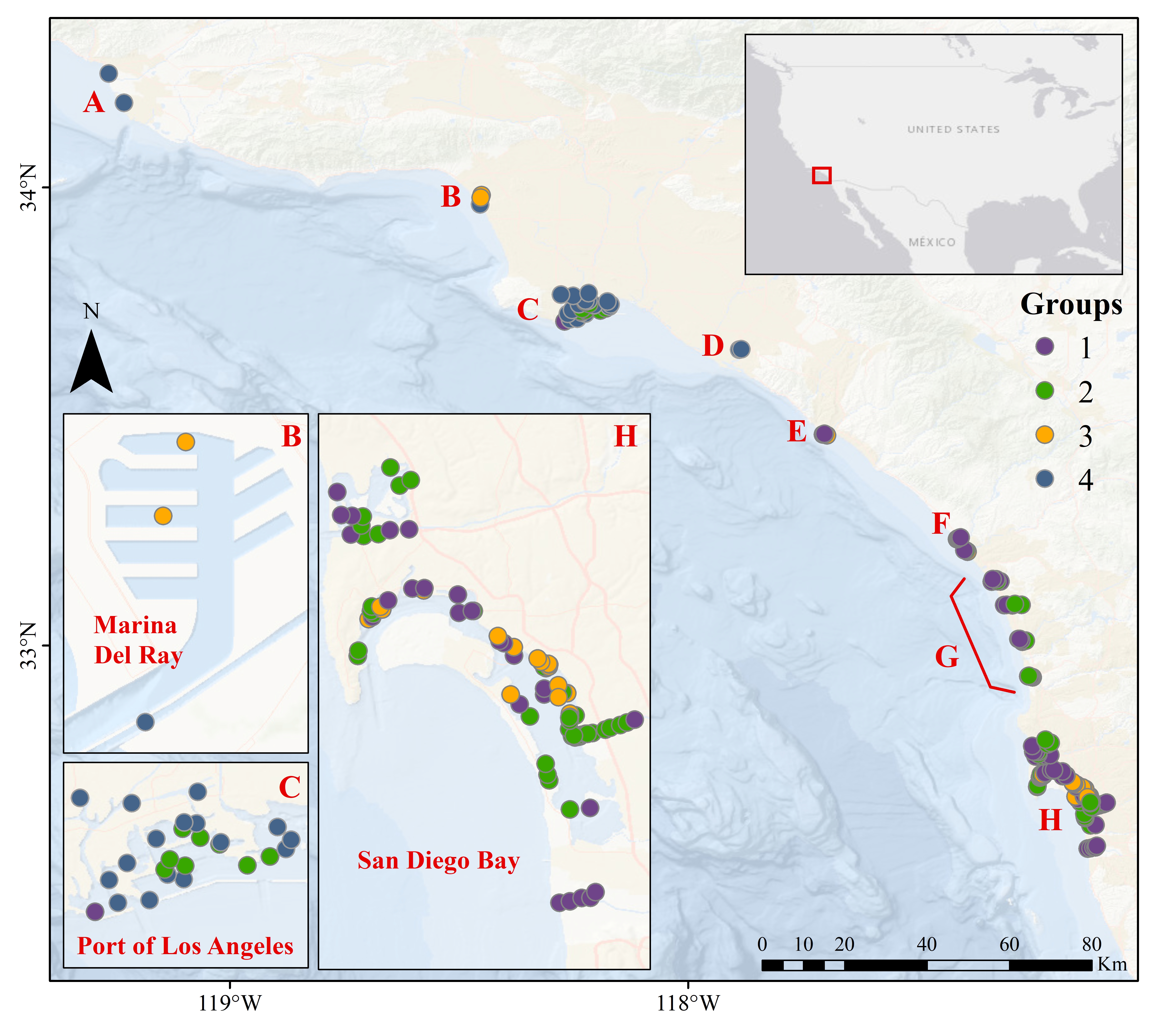
locs <- dat %>%
select(station, lon, lat) %>%
mutate(station = as.character(station))
prstr <- "+proj=longlat +datum=WGS84 +no_defs +ellps=WGS84 +towgs84=0,0,0"
toplo <- dat_frm_mets %>%
rownames_to_column('station') %>%
left_join(locs, by = 'station') %>%
mutate(Groups = grps) %>%
filter(!is.na(lon)) %>%
st_as_sf(coords = c('lon', 'lat'), crs = prstr)
mapview(toplo, zcol = 'Groups', col.regions = cols, layer.name = 'Groups')
st_write(toplo, here('data', 'sitegrps.shp'), delete_layer = T)knitr::include_graphics(here('figs', 'sitemap.jpg'))
Figure 1.8: Map showing site locations color-coded by clusters. A: Ventura-Oxnard, B: Marina Del Rey, C: Port of Los Angeles (San Pedro), D: Costa Mesa, E: Dana Point, F: Oceanside, G: Carlsbad-Encinitas-Solana Beach, H: San Diego Bay.