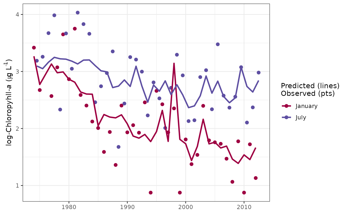
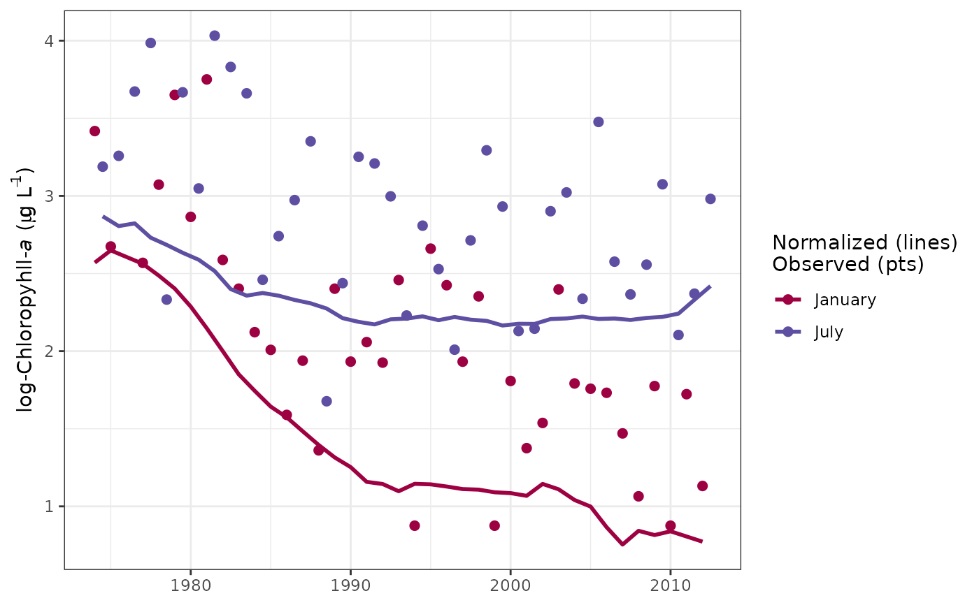
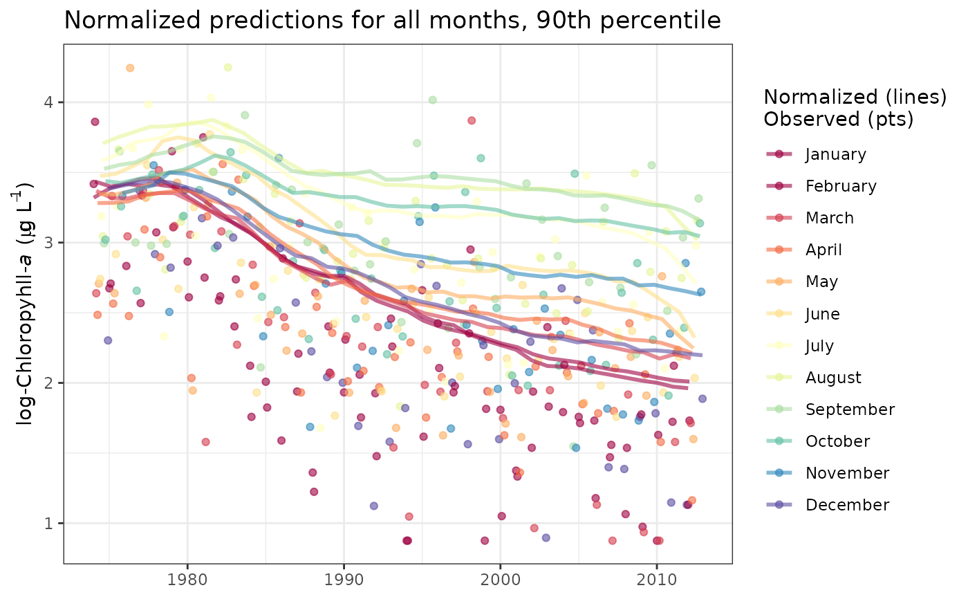
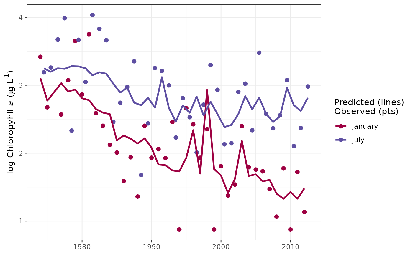
Plot time slices within a tidal object to view response variable observations, predictions, and normalized results at regular annual intervals.
sliceplot(dat_in, ...)

# S3 method for class 'tidal'
sliceplot(
  dat_in,
  slices = c(1, 7),
  tau = NULL,
  dt_rng = NULL,
  col_vec = NULL,
  predicted = TRUE,
  logspace = TRUE,
  grids = TRUE,
  pretty = TRUE,
  lwd = 1,
  size = 2,
  alpha = 1,
  ...
)

# S3 method for class 'tidalmean'
sliceplot(
  dat_in,
  slices = c(1, 7),
  predicted = TRUE,
  dt_rng = NULL,
  col_vec = NULL,
  logspace = TRUE,
  grids = TRUE,
  pretty = TRUE,
  lwd = 1,
  size = 2,
  alpha = 1,
  ...
)
Arguments
- dat_in
input tidal or tidalmean object
- ...
arguments passed to other methods
- slices
numeric vector of calender months to plot, i.e., 1 - 12
- tau
numeric vector of quantile to plot. The function will plot the 'middle' quantile if none is specified, e.g., if 0.2, 0.3, and 0.4 are present in the fitted model object then 0.3 will be plotted.
- dt_rng
Optional chr string indicating the date range of the plot. Must be two values in the format 'YYYY-mm-dd' which is passed to
as.Date.- col_vec
chr string of plot colors to use, passed to
gradcols. Any color palette from RColorBrewer can be used as a named input. Palettes from grDevices must be supplied as the returned string of colors for each palette.- predicted
logical indicating if standard predicted values are plotted, default
TRUE, otherwise normalized predictions are plotted- logspace
logical indicating if plots are in log space
- grids
logical indicating if grid lines are present
- pretty
logical indicating if my subjective idea of plot aesthetics is applied, otherwise the
ggplotdefault themes are used- lwd
numeric value indicating width of lines
- size
numeric value indicating size of points
- alpha
numeric value indicating transparency of points or lines
Value
A ggplot object that can be further modified
Details
This is a modification of fitplot that can be used to plot selected time slices from the results of a fitted tidal object. For example, all results for a particular month across all years can be viewed. This is useful for evaluating between-year differences in results for constant season. Only one quantile fit can be shown per plot because the grouping variable is mapped to the slices.
See also
Examples
## load a fitted tidal object
data(tidfit)

# plot using defaults
sliceplot(tidfit)


# get different months - march and september
sliceplot(tidfit, slices = c(3, 9))


# normalized predictions, 10th percentile
sliceplot(tidfit, tau = 0.1, predicted = FALSE)


# normalized values all months, change line aesthetics, log-space, 90th
# add title
library(ggplot2)
sliceplot(tidfit,
 slices = 1:12,
 size = 1.5,
 tau = 0.9,
 alpha = 0.6,
 predicted = FALSE,
 logspace = TRUE
) +
ggtitle('Normalized predictions for all months, 90th percentile')


 ## plot a tidalmean object
 data(tidfitmean)

 sliceplot(tidfitmean)
