Plot a tidal object to view response variable observations, predictions, and normalized results.
fitplot(dat_in, ...)

# S3 method for class 'tidal'
fitplot(
  dat_in,
  tau = NULL,
  predicted = TRUE,
  annuals = TRUE,
  logspace = TRUE,
  dt_rng = NULL,
  col_vec = NULL,
  grids = TRUE,
  min_mo = 9,
  mo_strt = 10,
  pretty = TRUE,
  lwd = 1,
  size = 2,
  alpha = 1,
  ...
)

# S3 method for class 'tidalmean'
fitplot(
  dat_in,
  predicted = TRUE,
  annuals = TRUE,
  logspace = TRUE,
  dt_rng = NULL,
  col_vec = NULL,
  grids = TRUE,
  min_mo = 9,
  mo_strt = 10,
  pretty = TRUE,
  lwd = 1,
  size = 2,
  alpha = 1,
  ...
)
Arguments
- dat_in
input tidal or tidalmean object
- ...
arguments passed to other methods
- tau
numeric vector of quantiles to plot, defaults to all in object if not supplied
- predicted
logical indicating if standard predicted values are plotted, default
TRUE, otherwise normalized predictions are plotted- annuals
logical indicating if plots are annual aggregations of results
- logspace
logical indicating if plots are in log space
- dt_rng
Optional chr string indicating the date range of the plot. Must be two values in the format 'YYYY-mm-dd' which is passed to
as.Date.- col_vec
chr string of plot colors to use, passed to
gradcols. Any color palette from RColorBrewer can be used as a named input. Palettes from grDevices must be supplied as the returned string of colors for each palette.- grids
logical indicating if grid lines are present
- min_mo
numeric value from one to twelve indicating the minimum number of months with observations for averaging by years, applies only if
annuals = TRUE. Seeannual_agg.- mo_strt
numeric indicating month to start aggregation years, defaults to October for USGS water year from October to September, applies only if
annuals = TRUE. Seeannual_agg.- pretty
logical indicating if my subjective idea of plot aesthetics is applied, otherwise the
ggplotdefault themes are used- lwd
numeric value indicating width of lines
- size
numeric value indicating size of points
- alpha
numeric value indicating transparency of points or lines
Value
A ggplot object that can be further modified
See also
Examples
## load a fitted tidal object
data(tidfit)
# plot using defaults
fitplot(tidfit)
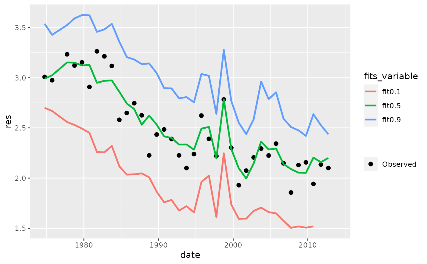
 # get the same plot but use default ggplot settings
fitplot(tidfit, pretty = FALSE)
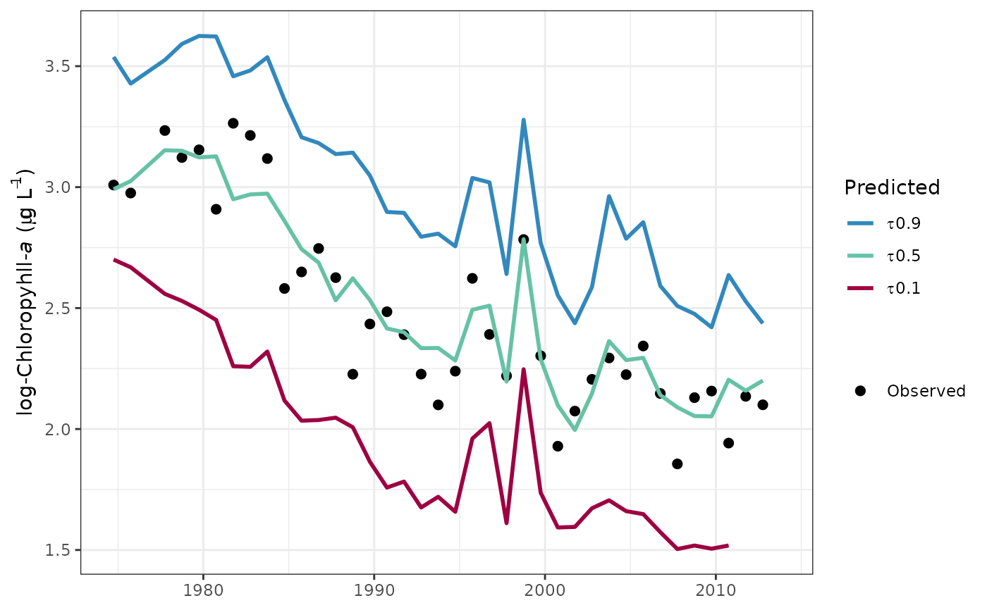
 # plot in log space
fitplot(tidfit, logspace = TRUE)
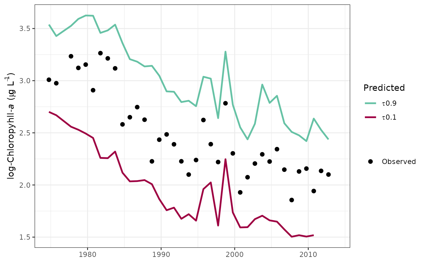
 # plot specific quantiles
fitplot(tidfit, tau = c(0.1, 0.9))
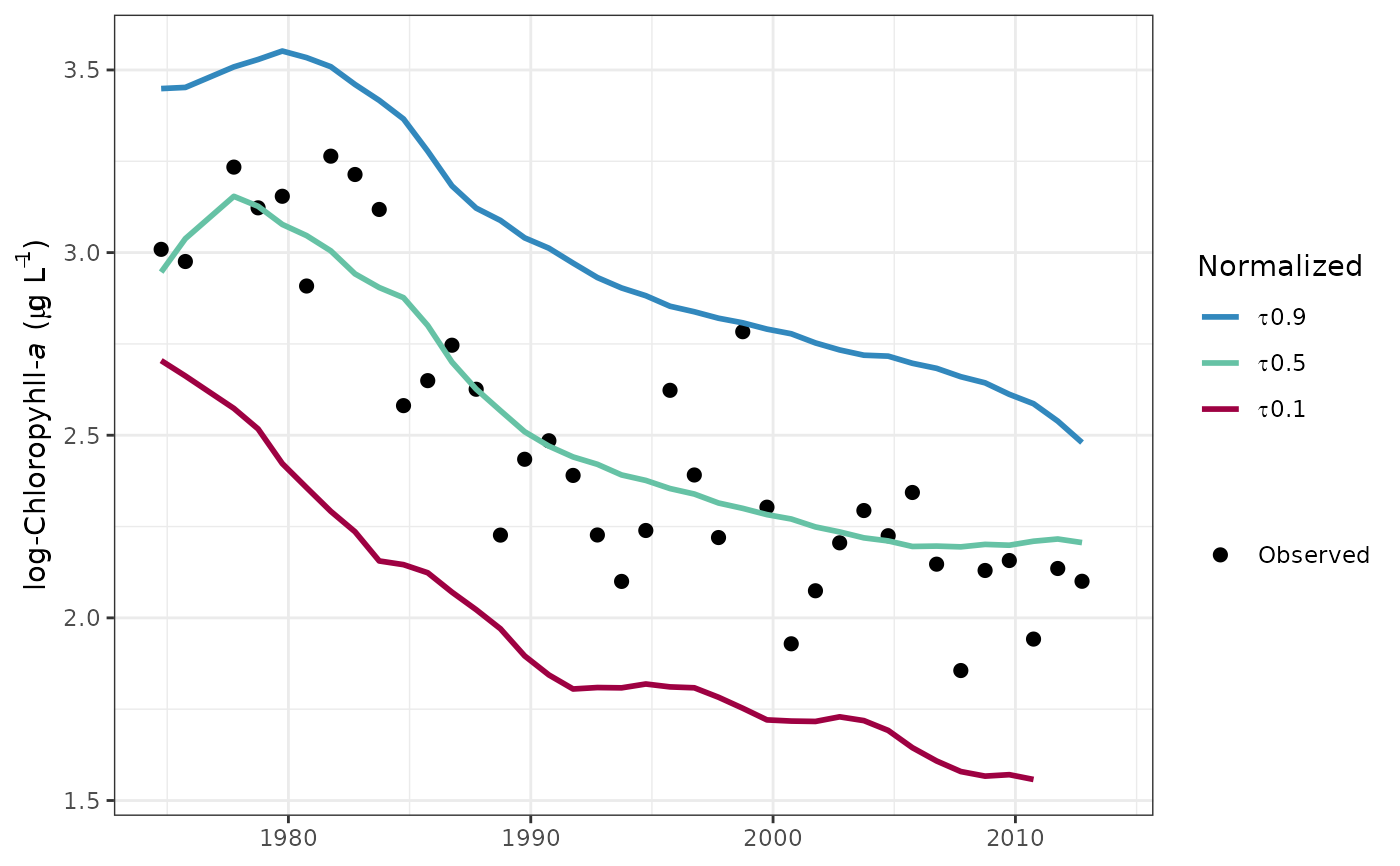
 # plot the normalized predictions
fitplot(tidfit, predicted = FALSE)
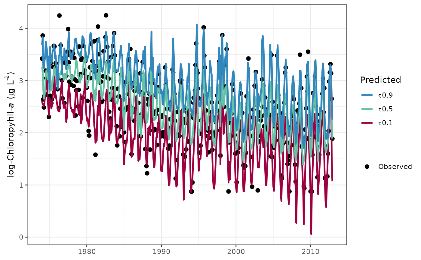
 # plot as monthly values
fitplot(tidfit, annuals = FALSE)
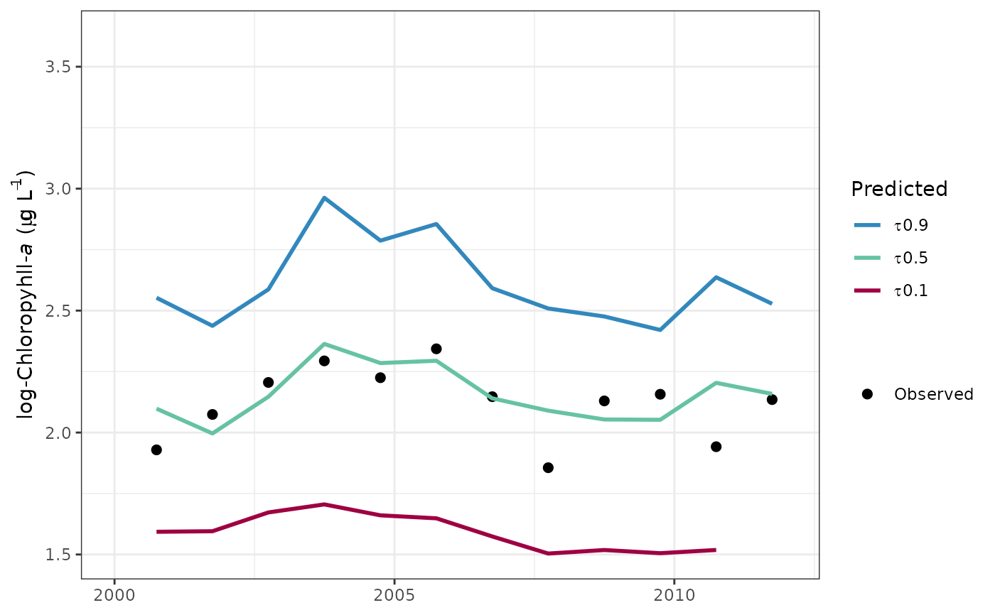
 # format the x-axis is using annual aggregations
library(ggplot2)
fitplot(tidfit, annual = TRUE) +
scale_x_date(limits = as.Date(c('2000-01-01', '2012-01-01')))
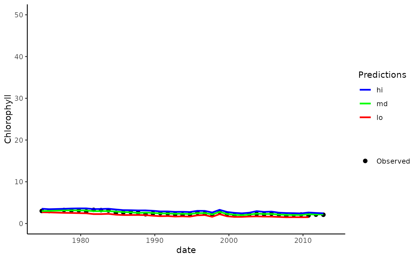
 # modify the plot as needed using ggplot scales, etc.
fitplot(tidfit, pretty = FALSE, linetype = 'dashed') +
theme_classic() +
scale_y_continuous(
'Chlorophyll',
limits = c(0, 50)
) +
scale_colour_manual(
'Predictions',
labels = c('lo', 'md', 'hi'),
values = c('red', 'green', 'blue'),
guide = guide_legend(reverse = TRUE)
)
 # plot a tidalmean object
data(tidfitmean)
fitplot(tidfitmean)
