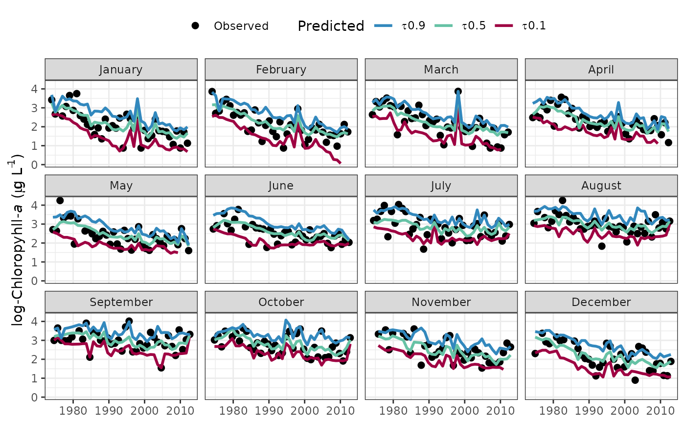
Plot a tidal object to view the response variable observations, predictions, and normalized results separately for each month.
fitmoplot(dat_in, ...)

# S3 method for class 'tidal'
fitmoplot(
  dat_in,
  month = c(1:12),
  tau = NULL,
  predicted = TRUE,
  logspace = TRUE,
  dt_rng = NULL,
  ncol = NULL,
  col_vec = NULL,
  grids = TRUE,
  pretty = TRUE,
  lwd = 1,
  size = 2,
  alpha = 1,
  ...
)

# S3 method for class 'tidalmean'
fitmoplot(
  dat_in,
  month = c(1:12),
  predicted = TRUE,
  logspace = TRUE,
  dt_rng = NULL,
  ncol = NULL,
  col_vec = NULL,
  grids = TRUE,
  pretty = TRUE,
  lwd = 1,
  size = 2,
  alpha = 1,
  ...
)
Arguments
- dat_in
input tidal or tidalmean object
- ...
arguments passed to other methods
- month
numeric indicating months to plot
- tau
numeric vector of quantiles to plot, defaults to all in object if not supplied
- predicted
logical indicating if standard predicted values are plotted, default
TRUE, otherwise normalized predictions are plotted- logspace
logical indicating if plots are in log space
- dt_rng
Optional chr string indicating the date range of the plot. Must be two values in the format 'YYYY-mm-dd' which is passed to
as.Date.- ncol
numeric argument passed to
facet_wrapindicating number of facet columns- col_vec
chr string of plot colors to use, passed to
gradcols. Any color palette from RColorBrewer can be used as a named input. Palettes from grDevices must be supplied as the returned string of colors for each palette.- grids
logical indicating if grid lines are present
- pretty
logical indicating if my subjective idea of plot aesthetics is applied, otherwise the
ggplotdefault themes are used- lwd
numeric value indicating width of lines
- size
numeric value indicating size of points
- alpha
numeric value indicating transparency of points or lines
Value
A ggplot object that can be further modified
Details
The plots are similar to those produced by fitplot except the values are faceted by month. This allows an evaluation of trends over time independent of seasonal variation. Multiple observations within each month for each year are averaged for a smoother plot.
See also
Examples
## load a fitted tidal object
data(tidfit)

# plot using defaults
fitmoplot(tidfit)
#> Warning: Removed 8 rows containing missing values or values outside the scale range
#> (`geom_line()`).

if (FALSE) { # \dontrun{
# get the same plot but use default ggplot settings
fitmoplot(tidfit, pretty = FALSE)

# plot specific quantiles
fitmoplot(tidfit, tau = c(0.1, 0.9))

# plot the normalized predictions
fitmoplot(tidfit, predicted = FALSE)

# modify the plot as needed using ggplot scales, etc.

library(ggplot2)

fitmoplot(tidfit, pretty = FALSE, linetype = 'dashed') +
 theme_classic() +
 scale_y_continuous(
   'Chlorophyll',
   limits = c(0, 5)
   ) +
 scale_colour_manual(
   'Predictions',
   labels = c('lo', 'md', 'hi'),
   values = c('red', 'green', 'blue'),
   guide = guide_legend(reverse = TRUE)
   )

# plot a tidalmean object
data(tidfitmean)

fitmoplot(tidfitmean)
} # }